Tax Document
Rebuilding Tax Document Collection for a Private Investment Team
Cambridge Associates' tax collection team was chasing K-1s, K-2s, K-3s, and PFIC forms across dozens of funds and investors every season, with a hard IRS deadline behind every missing file. Design team performed a digital transformation exercise to design and ship the tool that turned that chase into a queue they could actually see.
Role
UI/UX Designer
Team
Design Team
Developers Team
Business Team
Tools
Figma
Google Suits
Timeline
2023 - 4 weeks
Full Time
OVERVIEW
Every year, Cambridge Associates' clients invest through dozens of private funds, and each fund owes them a tax document reporting their share of that year's gains and losses. Multiply that across every client, every fund, every filing type, and you get a compliance operation racing against a fixed IRS deadline, run entirely out of Excel.
I was brought in to design the Tax Document Tracker, a tool to replace that spreadsheet with a live, role-aware system for collecting, verifying, and signing off on tax documents before filing season closes.
MY ROLE
As the sole designer on this project, I owned it end to end, shadowing the collection team to understand how the existing Excel process actually broke down under pressure, mapping their current workflow to surface where time and accuracy were being lost, and designing the dashboard, tracking interface, and intake flow that replaced it.
OVERVIEW
Patient 360 reenvisions the existing patient support platforms (Medallia, Qualtrics, Verint and others) already live and pulling in structured patient data through AI and machine learning. On paper, it had everything it needed. In practice, teams working inside it are stuck, KPI selections that produced blank charts instead of insight, no personalised direction on what to do next, and a rising cognitive load from a system that had data but no decision logic.
Rather than a full platform rebuild, this was a focused proof of concept: take two of the highest-friction domains like Access Solution and Voice of Customer, and redesign how each team could deep-dive into their own data independently, with clear guidance from insight to action.
MY ROLE
I owned this project end to end, from mapping the two domain stakeholders in this ecosystem around the platform, to diagnosing why the existing KPI logic was failing, to designing the individual Access Solution and Voice of Customer workflows following the Laws of Heuristics.
1.
Replaced the spreadsheet with a live system of record - Every fund's document status, once scattered across Excel and tracked by hand, now updates in real time
2.
Gave oversight a shape, without adding surveillance - The Lead can see the whole team's progress at a glance and drill into any one person's queue, without asking anyone for a status update or waiting on a manual report.
3.
Designed around usage frequency - Actions associates repeated all day, checking status, flagging a delay, got their own dedicated space, separated from tasks that only came up once a season.
Rebuilding Tax Document Collection for a Private Investment Team
Cambridge Associates' tax collection team was chasing K-1s, K-2s, K-3s, and PFIC forms across dozens of funds and investors every season, with a hard IRS deadline behind every missing file. Design team performed a digital transformation exercise to design and ship the tool that turned that chase into a queue they could actually see.
Role
UX Researcher
Product -
Service Designer
Team
Design Team
Developers Team
Business Team
Tools
Figma
Google Suits
Timeline
2023 - 4 weeks
Full Time
OVERVIEW
Every year, Cambridge Associates' clients invest through dozens of private funds, and each fund owes them a tax document reporting their share of that year's gains and losses. Multiply that across every client, every fund, every filing type, and you get a compliance operation racing against a fixed IRS deadline, run entirely out of Excel.
I was brought in to design the Tax Document Tracker, a tool to replace that spreadsheet with a live, role-aware system for collecting, verifying, and signing off on tax documents before filing season closes.
MY ROLE
As the sole designer on this project, I owned it end to end, shadowing the collection team to understand how the existing Excel process actually broke down under pressure, mapping their current workflow to surface where time and accuracy were being lost, and designing the dashboard, tracking interface, and intake flow that replaced it.
1.
Replaced the spreadsheet with a live system of record - Every fund's document status, once scattered across Excel and tracked by hand, now updates in real time
2.
Gave oversight a shape, without adding surveillance - The Lead can see the whole team's progress at a glance and drill into any one person's queue, without asking anyone for a status update or waiting on a manual report.
3.
Designed around usage frequency - Actions associates repeated all day, checking status, flagging a delay, got their own dedicated space, separated from tasks that only came up once a season.
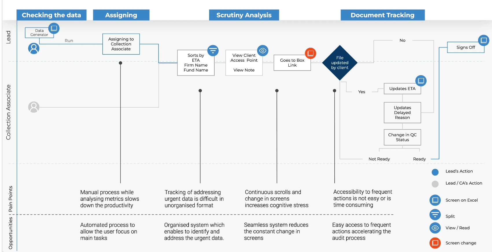
Workflow Analysis

1.
Document status lived in a spreadsheet.
We performed digital transformation, where every fund's document status lives in one place, updated in real time instead of manually.
2.
Verifying a document meant leaving the tracker entirely.
Each record now links directly to its source in Box, so an associate can verify a document without ever leaving the queue.
3.
Frequent actions were buried with everything else.
A dedicated quick-actions space holds the highest-frequency tasks separately, so they're never competing for attention with one-off work.
Directions that shaped the redesign:
Automate the assigning and repository step so the team could focus on the actual chase
Build one organized system to surface urgency automatically
Consolidate the number of screens a task requires
Give frequent actions their own accessible space
KEY FEATURES
Automating assigning
How does Lead see everything,
without asking everyone?
Before this, a Lead's only view into the team's progress was whatever they remembered or by chasing status and asking each associate directly. The design question was "what does oversight actually require, without turning into micromanagement." That meant separating two different needs: a rolled-up view of where the whole team stood, and a way to still see what any one person owned, without digging.
What data matters, to
whom, and where should it
live?
Every data point in this system serves someone differently, a payer needs claims history, a member needs their own health trend, a pharmacy needs a prescription, nothing more. Designing this meant asking what data was essential versus incidental, what could stay backstage, and what needed to surface at the front, and identifying which sources, existing or new, could actually feed this system.
Dashboard
A dashboard that shows team-wide progress, In Queue, Not Ready, Pending, QC Ready, Completed, alongside each associate's individual breakdown, updated live.
A Lead can see the whole season's health in one glance, or zoom into one person's queue without asking them for it.

Digital Transformation
What does an associate actually
need in front of them to do the work?
An associate's day was spent jumping between the sheet, their inbox, and wherever the file actually lived. The design question here was about reduction, deciding what belonged in the main view versus what could live one click deeper, so the table stayed scannable but nothing important got hidden. Status, ETA, and assignment needed to be visible at a glance; deeper detail, notes, delay reasons, the file link itself, could sit in a focused panel that opened only when needed.
What data matters, to
whom, and where should it
live?
Every data point in this system serves someone differently, a payer needs claims history, a member needs their own health trend, a pharmacy needs a prescription, nothing more. Designing this meant asking what data was essential versus incidental, what could stay backstage, and what needed to surface at the front, and identifying which sources, existing or new, could actually feed this system.
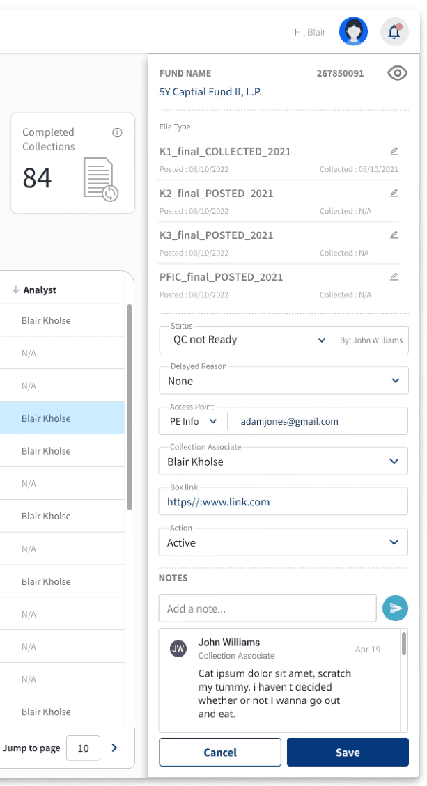
Tax Collection Table
A searchable, sortable queue where selecting any record opens a detail panel, so an associate can fully update a record without leaving it or losing their place in the table.

Design for Rhythm
A dedicated space for the highest-frequency actions, separated from the general table, so the tasks people repeat all day don't compete for attention with the ones they do once a season.
Structured Intake
How do you onboard a new client
without one form becoming unmanageable?
Every record in the tracker depends on accurate intake, getting the entity type or tax year wrong at this stage and it corrupts everything downstream. But a client relationship has genuinely different kinds of information: who they are, which fund and firm they're tied to, what documents to expect. The design question was whether one long form could actually serve three different mental models at once, and concluding it couldn't.
What data matters, to
whom, and where should it
live?
Every data point in this system serves someone differently, a payer needs claims history, a member needs their own health trend, a pharmacy needs a prescription, nothing more. Designing this meant asking what data was essential versus incidental, what could stay backstage, and what needed to surface at the front, and identifying which sources, existing or new, could actually feed this system.
New Entry Form
Intake split into three tabs, Client Management, Firm & Fund Management, Document Management, so fields are grouped the way the team actually thinks about a record, reducing the chance of a mis-entered field breaking something later.

Workflow Analysis

1.
Document status lived in a spreadsheet.
We performed digital transformation, where every fund's document status lives in one place, updated in real time instead of manually.
2.
Verifying a document meant leaving the tracker entirely.
Each record now links directly to its source in Box, so an associate can verify a document without ever leaving the queue.
3.
Frequent actions were buried with everything else.
A dedicated quick-actions space holds the highest-frequency tasks separately, so they're never competing for attention with one-off work.
Directions that shaped the redesign:
Automate the assigning and repository step so the team could focus on the actual chase
Build one organized system to surface urgency automatically
Consolidate the number of screens a task requires
Give frequent actions their own accessible space
KEY FEATURES
Automating assigning
How does Lead see everything,
without asking everyone?
Before this, a Lead's only view into the team's progress was whatever they remembered or by chasing status and asking each associate directly. The design question was "what does oversight actually require, without turning into micromanagement." That meant separating two different needs: a rolled-up view of where the whole team stood, and a way to still see what any one person owned, without digging.
Dashboard
A dashboard that shows team-wide progress, In Queue, Not Ready, Pending, QC Ready, Completed, alongside each associate's individual breakdown, updated live.
A Lead can see the whole season's health in one glance, or zoom into one person's queue without asking them for it.
Digital Transformation
What does an associate actually
need in front of them to do the work?
An associate's day was spent jumping between the sheet, their inbox, and wherever the file actually lived. The design question here was about reduction, deciding what belonged in the main view versus what could live one click deeper, so the table stayed scannable but nothing important got hidden. Status, ETA, and assignment needed to be visible at a glance; deeper detail, notes, delay reasons, the file link itself, could sit in a focused panel that opened only when needed.
Tax Collection Table
A searchable, sortable queue where selecting any record opens a detail panel, so an associate can fully update a record without leaving it or losing their place in the table.

Design for Rhythm
A dedicated space for the highest-frequency actions, separated from the general table, so the tasks people repeat all day don't compete for attention with the ones they do once a season.
Structured Intake
How do you onboard a new client
without one form becoming unmanageable?
Every record in the tracker depends on accurate intake, getting the entity type or tax year wrong at this stage and it corrupts everything downstream. But a client relationship has genuinely different kinds of information: who they are, which fund and firm they're tied to, what documents to expect. The design question was whether one long form could actually serve three different mental models at once, and concluding it couldn't.
New Entry Form
Intake split into three tabs, Client Management, Firm & Fund Management, Document Management, so fields are grouped the way the team actually thinks about a record, reducing the chance of a mis-entered field breaking something later.
Outcome
1.
Replaced the spreadsheet with a live system of record - Every fund's document status, once scattered across Excel and tracked by hand, now updates in real time
2.
Gave oversight a shape, without adding surveillance - The Lead can see the whole team's progress at a glance and drill into any one person's queue, without asking anyone for a status update or waiting on a manual report.
3.
Designed around usage frequency - Actions associates repeated all day, checking status, flagging a delay, got their own dedicated space, separated from tasks that only came up once a season.
Workflow Analysis
1.
Document status lived in a spreadsheet.
We performed digital transformation, where every fund's document status lives in one place, updated in real time instead of manually.
2.
Verifying a document meant leaving the tracker entirely.
Each record now links directly to its source in Box, so an associate can verify a document without ever leaving the queue.
3.
Frequent actions were buried with everything else.
A dedicated quick-actions space holds the highest-frequency tasks separately, so they're never competing for attention with one-off work.
Directions that shaped the redesign:
Automate the assigning and repository step so the team could focus on the actual chase
Build one organized system to surface urgency automatically
Consolidate the number of screens a task requires
Give frequent actions their own accessible space
KEY FEATURES
Automating assigning
How does Lead see everything,
without asking everyone?
Before this, a Lead's only view into the team's progress was whatever they remembered or by chasing status and asking each associate directly. The design question was "what does oversight actually require, without turning into micromanagement." That meant separating two different needs: a rolled-up view of where the whole team stood, and a way to still see what any one person owned, without digging.
Dashboard
A dashboard that shows team-wide progress, In Queue, Not Ready, Pending, QC Ready, Completed, alongside each associate's individual breakdown, updated live.
A Lead can see the whole season's health in one glance, or zoom into one person's queue without asking them for it.
Digital Transformation
What does an associate actually
need in front of them to do the work?
An associate's day was spent jumping between the sheet, their inbox, and wherever the file actually lived. The design question here was about reduction, deciding what belonged in the main view versus what could live one click deeper, so the table stayed scannable but nothing important got hidden. Status, ETA, and assignment needed to be visible at a glance; deeper detail, notes, delay reasons, the file link itself, could sit in a focused panel that opened only when needed.
Tax Collection Table
A searchable, sortable queue where selecting any record opens a detail panel, so an associate can fully update a record without leaving it or losing their place in the table.
Design for Rhythm
A dedicated space for the highest-frequency actions, separated from the general table, so the tasks people repeat all day don't compete for attention with the ones they do once a season.
Structured Intake
How do you onboard a new client
without one form becoming unmanageable?
Every record in the tracker depends on accurate intake, getting the entity type or tax year wrong at this stage and it corrupts everything downstream. But a client relationship has genuinely different kinds of information: who they are, which fund and firm they're tied to, what documents to expect. The design question was whether one long form could actually serve three different mental models at once, and concluding it couldn't.
New Entry Form
Intake split into three tabs, Client Management, Firm & Fund Management, Document Management, so fields are grouped the way the team actually thinks about a record, reducing the chance of a mis-entered field breaking something later.
Workflow Analysis
1.
Document status lived in a spreadsheet.
We performed digital transformation, where every fund's document status lives in one place, updated in real time instead of manually.
2.
Verifying a document meant leaving the tracker entirely.
Each record now links directly to its source in Box, so an associate can verify a document without ever leaving the queue.
3.
Frequent actions were buried with everything else.
A dedicated quick-actions space holds the highest-frequency tasks separately, so they're never competing for attention with one-off work.
Directions that shaped the redesign:
Automate the assigning and repository step so the team could focus on the actual chase
Build one organized system to surface urgency automatically
Consolidate the number of screens a task requires
Give frequent actions their own accessible space
KEY FEATURES
Automating assigning
How does Lead see everything,
without asking everyone?
Before this, a Lead's only view into the team's progress was whatever they remembered or by chasing status and asking each associate directly. The design question was "what does oversight actually require, without turning into micromanagement." That meant separating two different needs: a rolled-up view of where the whole team stood, and a way to still see what any one person owned, without digging.
Dashboard
A dashboard that shows team-wide progress, In Queue, Not Ready, Pending, QC Ready, Completed, alongside each associate's individual breakdown, updated live.
A Lead can see the whole season's health in one glance, or zoom into one person's queue without asking them for it.
Digital Transformation
What does an associate actually
need in front of them to do the work?
An associate's day was spent jumping between the sheet, their inbox, and wherever the file actually lived. The design question here was about reduction, deciding what belonged in the main view versus what could live one click deeper, so the table stayed scannable but nothing important got hidden. Status, ETA, and assignment needed to be visible at a glance; deeper detail, notes, delay reasons, the file link itself, could sit in a focused panel that opened only when needed.
Tax Collection Table
A searchable, sortable queue where selecting any record opens a detail panel, so an associate can fully update a record without leaving it or losing their place in the table.
Design for Rhythm
A dedicated space for the highest-frequency actions, separated from the general table, so the tasks people repeat all day don't compete for attention with the ones they do once a season.
Structured Intake
How do you onboard a new client
without one form becoming unmanageable?
Every record in the tracker depends on accurate intake, getting the entity type or tax year wrong at this stage and it corrupts everything downstream. But a client relationship has genuinely different kinds of information: who they are, which fund and firm they're tied to, what documents to expect. The design question was whether one long form could actually serve three different mental models at once, and concluding it couldn't.
New Entry Form
Intake split into three tabs, Client Management, Firm & Fund Management, Document Management, so fields are grouped the way the team actually thinks about a record, reducing the chance of a mis-entered field breaking something later.
Outcome
1.
Replaced the spreadsheet with a live system of record - Every fund's document status, once scattered across Excel and tracked by hand, now updates in real time
2.
Gave oversight a shape, without adding surveillance - The Lead can see the whole team's progress at a glance and drill into any one person's queue, without asking anyone for a status update or waiting on a manual report.
3.
Designed around usage frequency - Actions associates repeated all day, checking status, flagging a delay, got their own dedicated space, separated from tasks that only came up once a season.