AML
What is AMLi
(Anti-Money Laundering Insights)?
Anti-money laundering platforms are what banks use to investigate flagged transactions and prove to regulators that those investigations were actually done properly.
They typically let investigators search across customers, accounts, and transaction history to build a case, and give a quality team a way to check that case before it's considered closed. Analysts, compliance officers, and quality reviewers are the usual users, each looking at the same case, but from a different responsibility.
AMLi at PNC
At PNC, this took shape as two connected phases inside AMLi. The team's first focus was investigation, giving analysts a faster, more reliable way to search for the people, organisations, and transactions behind a flagged case. Once that was in place, the focus moved downstream to the QA and Rework module, the layer where a Quality Analyst independently checks a completed case, and a Staff Manager verifies that check, before anything is considered closed.
Design decisions and collaborations
How design interventions happened.
I spoke directly with investigation analyst to understand where the platform was breaking down for them, worked with developers to understand the technical constraints behind it, and aligned with product on where the platform needed to go. That combination shaped the UX strategy, effectively an audit of why the platform wasn't working for the people using it, and a case for what design could realistically fix.
Design moved from designing in Figma → wireframes in Sketch/ or reverse, with Confluence and Jira used to document decisions and keep the work visible to the wider team.
The design system followed the bank's existing toolkit, keeping every screen aligned to PNC's brand guidelines rather than introducing a separate visual language.
Once designs were built, I ran a UI QA, cataloguing inconsistencies and bugs in Jira before handoff.

SEARCH PLATFORM
KEY FEATURES
Search & Investigation
Stackable match types
Exact, Partial, Phonetic, and Similarity could be combined on one search instead of run one at a time, replacing a process that took several re-runs with a single query that shows every kind of match at once, grouped by confidence.


Declutter the Data
Table and data
The earlier version leaned on heavy row colouring, which made the table feel dense and harder to parse before anyone even got to a number.
Design pulled that weight back, and added filtering and column sorting, so someone could narrow the list or reorder it around what mattered, instead of scanning row by row looking for it.


A graph for one clear signal
Sent and received activity sit side by side, with a running average tracked against them. The chart is built to answer one question, is this normal or anomaly rather than display everything the system happens to know.
FIU - QA and Rework
1.
There was no dashboard showing which cases were opened, in draft, assigned, or completed. That status lived in a spreadsheet, maintained separately, which meant it was only ever as current as the last manual update.
2.
Cases were assigned by email, one at a time, with no visibility into how much any given analyst was already carrying. There was no way to balance the load, an analyst could be quietly overloaded while another had capacity.
3.
If a Staff Manager had feedback on a review, or a question about why something was scored the way it was, that conversation happened outside the tool entirely, over email, or in person. The case itself had no memory of that exchange, so the reasoning behind a decision could easily get lost.
KEY FEATURES
Visibility & Control
A dashboard that shows whats happening
Open, draft, assigned, and completed cases are visible at a glance, for an individual analyst or across the team, replacing a spreadsheet that was only ever as current as its last manual update.

Collaboration & Governance
Case ownership that can move with the work
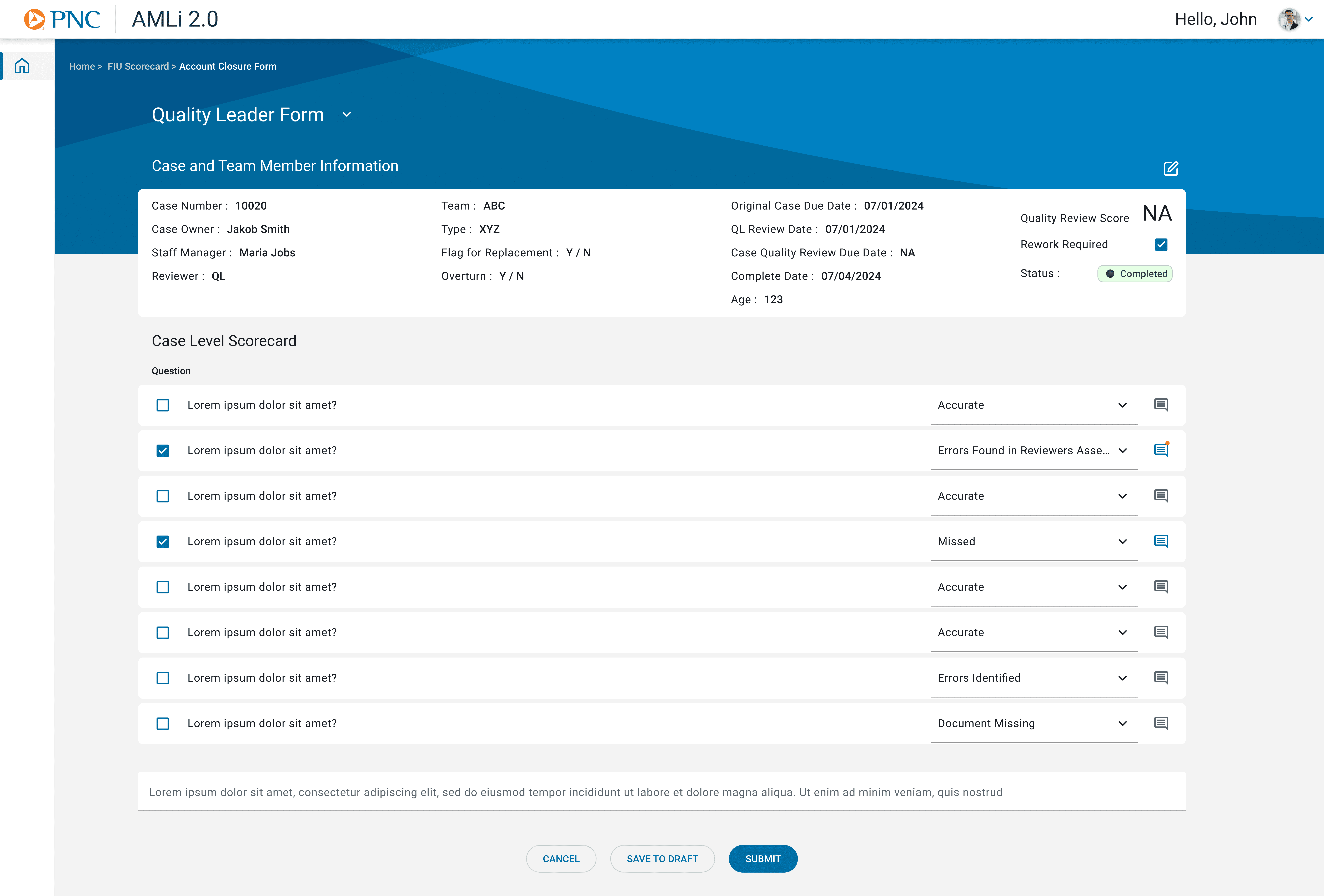
A case owner can be modified directly, with fields like Flag for Replacement built into the form itself, so passing a case along, or flagging it for reassignment, happens in-platform instead of over email.


Collaboration that stays attached to the case
A Staff Manager can comment directly on a case, so feedback and the reasoning behind a decision live with the review itself, instead of scattered across emails and conversations no one can trace back later.
Reassessment, closed in the same place it started
Quality Leader approval happens in the same platform and form as everything before it, no handoff to a separate system, no status that has to be manually reconciled after the fact.
OUTCOME
What we improved
1.
Brought quality review into one system.
Status, assignment, and feedback used to live in separate places and untraceable conversations. Now the whole review lifecycle happens in one place.
2.
Turned search from a guess into a comparison.
Investigators used to commit to one match type and re-run the search to try another. Now every match type is visible together, so the right result can be spotted in one pass.
3.
Made "done" mean something checkable.
A finished case used to just be a status. Now it carries a score, a reason if it's reworked, and a record of who approved it, something someone else can actually verify later.