Fx_Payments
Service Design Course
For our design strategies course, we were given a set of domains to explore, and I chose finance. Within that, the brief pointed to a scenario where a bank was trying to build better experiences for younger customers, specifically thinking about how fintech was expanding and what design decisions could help banks retain future customers and build a more modern experience.
Since a few of us in the group were international students, it was easier to anchor that direction in something we'd lived ourselves, cross-border money transfers and forex, drawing on our own experience, social listening, and conversations with other international student friends.
How might we turn a moment of financial anxiety into a moment that builds trust, for today's parents and tomorrow's decision-makers?
Before designing a solution, we needed to understand the scale of the opportunity and the real cost of the status quo

~95%
of the Indian student remittance still go through traditional banks
AMLi at PNCSearch was the first thing every investigator touched, and it was also where trust in the platform started to break down. The problems weren't isolated — a slow result fed into a confusing filter, which fed into a results screen that was hard to make sense of once you got there. Three patterns kept showing up.
~85%
of consumers report high trust in fintech
AMLi at PNCSearch was the first thing every investigator touched, and it was also where trust in the platform started to break down. The problems weren't isolated — a slow result fed into a confusing filter, which fed into a results screen that was hard to make sense of once you got there. Three patterns kept showing up.
(FTA/Morning Consult, 2025)
~3-3.5%
hidden forex markup on international transfers
AMLi at PNCSearch was the first thing every investigator touched, and it was also where trust in the platform started to break down. The problems weren't isolated — a slow result fed into a confusing filter, which fed into a results screen that was hard to make sense of once you got there. Three patterns kept showing up.
2-5 days
to process a single cross-border education transfer
AMLi at PNCSearch was the first thing every investigator touched, and it was also where trust in the platform started to break down. The problems weren't isolated — a slow result fed into a confusing filter, which fed into a results screen that was hard to make sense of once you got there. Three patterns kept showing up.
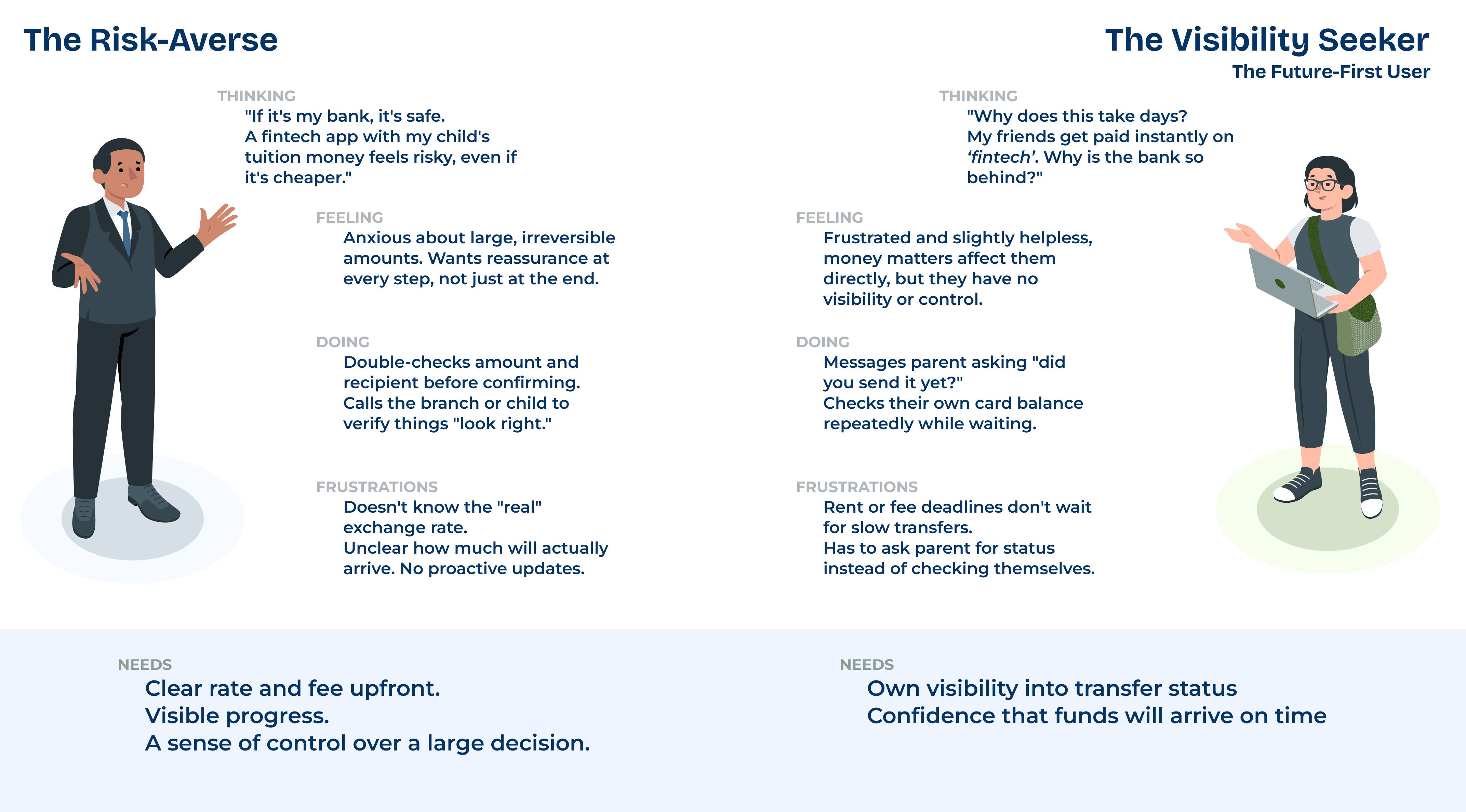
Mental Models
The same transfer means something very different to each of them
Strength and Gaps: Bank vs Fintech
Understanding what each side gets right before designing the fix
Strength and Gaps: Bank vs Fintech
Understanding what each side gets right before designing the fix

How a forex transfer actually happens
From request to arrival, what the customer sees, and what the bank is actually doing
How a forex transfer actually happens
From request to arrival, what the customer sees, and what the bank is
actually doing

Moments that Matter
The transfer process had a chain of small frictions, each one feeding into the next. A slow, document-heavy start led into an opaque rate, which led into a silent wait with no way to check in. Four moments kept showing up.
AMLi at PNCSearch was the first thing every investigator touched, and it was also where trust in the platform started to break down. The problems weren't isolated — a slow result fed into a confusing filter, which fed into a results screen that was hard to make sense of once you got there. Three patterns kept showing up.
1.
The time cost
Customers lose real time gathering documents, scheduling a branch visit, and traveling, often during their own working hours, before the transfer even begins.
2.
The manual trace
Staff manually verify documents and trace transaction data line by line, repetitive work that scales poorly and pulls time from higher-value tasks.
3.
The rate - black box
The actual amount being charged isn't clear until the SWIFT message is generated, customers commit before they can verify they're getting a fair rate.
4.
The silent wait
Once sent, there's no visibility into progress, customers wait anxiously, repeatedly messaging their child to check if funds arrived.
1.
Performance &
Trust
Performance wasn't consistent, the same search could return quickly one time and delay the next, with no clear reason why. For investigators working against real cases, that unpredictability made the platform feel like something to work around rather than rely on.
2.
Friction to get there
Getting from a query to an actual result took around four clicks, and the filters meant to speed that up were confusing in their own right, structured in a way that didn't match how investigators actually thought about narrowing a search.
3.
Hard to read once
you get there
Even once results loaded, the table was dense and cluttered, making it hard to tell one match from another at a glance. Deeper into a case, the transaction history graph often failed to populate.
KEY FEATURES
Transparency
How can we turn a hidden fee into
a visible trust signal?
How do we bring transparency into a moment that's traditionally been opaque? How does the fee distribution stay visually clear enough that it doesn't read as something being hidden?
These were the questions that shaped this screen, but showing it in a way that proves nothing is bundled or buried. The mid-market rate sits next to the bank's rate, and every charge is broken into its own line, so trust doesn't have to be taken on faith.
Clear Information
Currency, rate, and fees laid out with clear visual separation, so nothing feels buried or bundled together.

Visibility
How might we replace the silent wait
with clarity?
What is the customer actually feeling during this wait? What makes that wait feel less confusing or worrying? How do you design for a gap in time, not just a moment of input? These were the questions behind this screen. The transfer's real progress, already tracked internally through SWIFT's GPI system, was surfaced as a visible timeline instead of staying invisible to the customer. Each stage is named plainly, with a clear point showing exactly where things stand right now.

Status indicator
A visible timeline replaces the blank "processing" state, showing exactly where the transfer is, not just that it's happening.
Reduced effort
How might we make regulatory steps
feel like reassurance, not friction?
Does a compliance form need to feel separate from everything the customer just did? What if Form A2 didn't ask for information a second time, but simply confirmed what had already been entered? These were the questions behind this screen. Recipient details, purpose, and amount, all captured earlier in the flow, are pulled directly into the declaration, so the customer is only asked to confirm and consent, not re-enter data the app already has.
Smart form filling
Form A2 pulls forward what's already been entered, the customer confirms, instead of filling it out twice.

OUTCOME
1.
Turned a hidden fee into a visible number.
The exchange rate used to carry a markup with no way to check. Now the mid-market rate sits next to the bank's rate, and every charge is broken into its own line, so nothing is bundled or buried.
2.
Replaced a silent wait with a status that can be tracked.
A transfer used to disappear into a generic "processing" state for days. Now its real progress is surfaced as a visible timeline, with a clear point showing exactly where things stand.
3.
Made setup and compliance something you do once, not every time.
Recipients and documents used to be re-entered for every transfer. Now saved recipients and pre-uploaded documents make sending a single tap.
Redesigned how families send money abroad, replacing silent waits visible, trustworthy transfers
A concept project for a global bank that redesigned the cross-border remittance experience for families funding education abroad, replacing an opaque exchange rate and a multi-day blind wait with upfront transparency and real-time status.
Role
Product Designer
Team
Design Director
Development Team
Business Team
Tools
Figma
Sketch
Confluence
Jira
Timeline
2023 - 4 weeks
Full Time
Role
Product Designer
Project
Design Strategy Course
Tools
Figma
Claude
Timeline
2025 - 1 week
OVERVIEW
Cross-border remittance is one of the highest-trust, highest-stakes interactions a bank has with a family, and for Indian families funding a child's education abroad, it happens repeatedly, often under time pressure. Despite fintech alternatives offering visible rates and real-time tracking, over 95% of these transfers still go through traditional banks, largely on trust. But that trust comes with a real, hidden cost: exchange rate markups baked into an opaque rate, and a multi-day transfer with no visibility into what's actually happening.
This concept project redesigns that experience for a bank, making the true cost of a transfer visible before commitment, and replacing a silent wait with a status the customer can actually track.
MY ROLE
This was a self-initiated concept project, worked on end-to-end and independently, research, problem framing, and interface design. It grew out of an open-ended brief during my Master's coursework - Design Strategies. The group's early framing and discussion shaped the initial direction; the market research, business case, and interface design here were built by me independently.
OUTCOME
1.
Turned a hidden fee into a visible number.
The exchange rate used to carry a markup with no way to check. Now the mid-market rate sits next to the bank's rate, and every charge is broken into its own line, so nothing is bundled or buried.
2.
Replaced a silent wait with a status that can be tracked.
A transfer used to disappear into a generic "processing" state for days. Now its real progress is surfaced as a visible timeline, with a clear point showing exactly where things stand.
3.
Made setup and compliance something you do once, not every time.
Recipients and documents used to be re-entered for every transfer. Now saved recipients and pre-uploaded documents make sending a single tap.
Redesigned how families send money abroad, replacing silent waits visible, trustworthy transfers
A concept project for a global bank that redesigned the cross-border remittance experience for families funding education abroad, replacing an opaque exchange rate and a multi-day blind wait with upfront transparency and real-time status.
Role
UX Researcher
Product -
Service Designer
Team
Design Director
Development Team
Business Team
Tools
Figma
Sketch
Confluence
Jira
Timeline
2023 - 4 weeks
Full Time
Role
Product Designer
Project
Design Strategy Course
Tools
Figma
Claude
Timeline
2025 - 1 week
OVERVIEW
Cross-border remittance is one of the highest-trust, highest-stakes interactions a bank has with a family, and for Indian families funding a child's education abroad, it happens repeatedly, often under time pressure. Despite fintech alternatives offering visible rates and real-time tracking, over 95% of these transfers still go through traditional banks, largely on trust. But that trust comes with a real, hidden cost: exchange rate markups baked into an opaque rate, and a multi-day transfer with no visibility into what's actually happening.
This concept project redesigns that experience for a bank, making the true cost of a transfer visible before commitment, and replacing a silent wait with a status the customer can actually track.
MY ROLE
This was a self-initiated concept project, worked on end-to-end and independently, research, problem framing, and interface design. It grew out of an open-ended brief during my Master's coursework - Design Strategies. The group's early framing and discussion shaped the initial direction; the market research, business case, and interface design here were built by me independently.
OUTCOME
1.
Turned a hidden fee into a visible number.
The exchange rate used to carry a markup with no way to check. Now the mid-market rate sits next to the bank's rate, and every charge is broken into its own line, so nothing is bundled or buried.
2.
Replaced a silent wait with a status that can be tracked.
A transfer used to disappear into a generic "processing" state for days. Now its real progress is surfaced as a visible timeline, with a clear point showing exactly where things stand.
3.
Made setup and compliance something you do once, not every time.
Recipients and documents used to be re-entered for every transfer. Now saved recipients and pre-uploaded documents make sending a single tap.