Healthcare 360
Healthcare 360
From static policies to a system that responds to you
Healthcare 360 pulls claims, device data, and provider history out of separate silos and into a single, continuously updating view, so insurance can shift from static risk assumptions to proactive, personalised policies.
Role
UX Researcher
Product Designer
Team
Design Director
Life Sciences Director
Data and AI Lead
Timeline
2023 - 6 weeks
Full Time
OVERVIEW
Claims, device and pharmacy data sit in systems that don't link. So a warning sign, like a rising glucose reading, goes unnoticed until it becomes a claim. Healthcare 360 connects them into one view.
Healthcare 360 is a B2B platform that consolidates these signals into one continuously updating profile, so insurers can move from static underwriting to real-time, personalised policies.
MY ROLE
I led this project as UX and Product designer, embedded with the cross-functional team and connected directly with SME across insurance and life science domains to ground the design in how risk, claims, and care actually move through the system.
OVERVIEW
Claims, device and pharmacy data sit in systems that don't link. So a warning sign, like a rising glucose reading, goes unnoticed until it becomes a claim. Healthcare 360 connects them into one view.
Healthcare 360 is a B2B platform that consolidates these signals into one continuously updating profile, so insurers can move from static underwriting to real-time, personalised policies.
MY ROLE
I led this project as UX and Product designer, embedded with the cross-functional team and connected directly with SME across insurance and life science domains to ground the design in how risk, claims, and care actually move through the system.
OUTCOME
1.
Consolidated 5 fragmented data sources, claims, device data, provider history, pharmacy, and policy data, into one continuously updating member view.
2.
Designed a two-part scoring system (Follow-up + Self-Monitor) that turned passive health data into a visible, actionable signal for both member and insurer.
3.
Shifted the product model from reactive to proactive, from a policy members checked only during a claim, to a system that nudges, alerts, and adjusts based on real behaviour.
Healthcare 360
From static policies to a system that responds to you
Healthcare 360 pulls claims, device data, and provider history out of separate silos and into a single, continuously updating view, so insurance can shift from static risk assumptions to proactive, personalised policies.
Role
UX Researcher
Product -
Service Designer
Team
Design Director
Life Sciences Director
Data and AI Lead
Timeline
2023 - 6 weeks
Full Time
OVERVIEW
Data Quality Xpert is an AI-enabled enterprise platform designed to help organisations move from reactive data issue handling to proactive, business-aligned data quality management. By unifying monitoring, prioritisation, remediation, and impact visibility, the platform enables data teams and business leaders to act faster, with clarity and confidence.
MY ROLE
I was the sole designer on this project, embedded in a cross-functional team of data engineers, business analysts, and technical leads. Everything you read here is my work, from scoping the research to shipping the final prototype.
Enterprise data teams were drowning, not in bad data, but in disconnected tools with no unified view. Issues lived in one place, business impact in another, remediation in a third. Nothing talked to anything.
Over 10 weeks I designed an end-to-end platform (0 - 1 product) that connected all three into one coherent workflow, delivered as an MVP.
OUTCOME
1.
Consolidated 5 fragmented data sources, claims, device data, provider history, pharmacy, and policy data, into one continuously updating member view.
2.
Designed a two-part scoring system (Follow-up + Self-Monitor) that turned passive health data into a visible, actionable signal for both member and insurer.
3.
Shifted the product model from reactive to proactive, from a policy members checked only during a claim, to a system that nudges, alerts, and adjusts based on real behaviour.
Need of Healthcare360
Insurance is silent between claims.
Most members hear from their insurer at renewal and when something goes wrong. In between, the app has nothing to say, and nothing they do day to day changes their policy.
The data to change that already existed. It sat in separate systems for claims, devices, pharmacy and provider history, and none of it reached the member.
RESEARCH
As the researcher,
Finding what every
"360" app still left out
Expert Sessions
To check every assumption against how risk, claims and care really move, I worked with specialists from insurance and life sciences.
Who is Healthcare360 for?

App Audit
To see what a “complete” insurance app means in this market today, I walked through [7] insurer apps on the App Store and Play Store.
Most existing health insurance apps are built around:
transactions
claims
provider search
digital ID cards
payments
Few apps layer on:
Tele-consultations
Auto-check ins
Pharmacy refills

The apps offered services,
not a connected experience.
Across the market, a consistent pattern emerged: while some platforms offer advanced services like auto check-ins, pharmacy refills, and tele-consultations, these features lived in isolation, inconsistently implemented, and disconnected from any single view of the member.
How the apps scored on the criteria that mattered
I scored every app against the same seven criteria, chosen from what members use most: claims, ID cards, support, refills and virtual care. The grey shape shows how well the market covers each one today.
Key Evaluation Criteria & Observations
The analysis revealed recurring patterns across platforms:
Claim history & Stage clarity
Robot-chat assistance
Quick actions & accessibility
Auto-renewals & refills
Geography based services
Digital insurance cards
Virtual services
Current Market Capabilities
Healthcare 360 Vision
Key Evaluation Criteria & Observations
The analysis revealed recurring patterns across platforms:
Claim history & Stage clarity
Robot-chat assistance
Quick actions & accessibility
Auto-renewals & refills
Geography based services
Digital insurance cards
Virtual services
Current Market Capabilities
Healthcare 360 Vision

Ecosystem Mapping
To find where information breaks, beyond any single app, I mapped how data, claims and payments move between members, providers, administrators and payers.
Every dependency and coordination gap traced back to the same root, data that existed, but didn't connect. This became the thesis for everything that followed: one system, one continuous view.
What these research and maps pointed towards?
It surfaced where data broke, but it also pointed to where the opportunity was. A few directions became clear before we started scoping:
1.
Consolidation isn't a feature,
it's the foundation.
Consolidation isn't a
feature, it's the
foundation.
Every gap traced back to disconnected data, so any solution had to start with a single, continuous view, not another siloed tool.
2.
Engagement had no reason
to exist between claims.
Engagement had no
reason to exist
between claims.
Existing apps only mattered to members at the moment of a claim or provider search, there was no ongoing relationship in between.
3.
Behaviour was invisible to
the system
Behaviour was
invisible to the
system
Device and lifestyle data existed but was never fed back into risk or policy, so insurers had no way to reward or respond to it.
4.
Personalisation required a
mechanism, not just data
Personalisation
required a
mechanism, not just
data
Having a unified view wasn't enough on its own, it needed something that translated data into a visible, actionable signal for both insurer and member.
Healthcare360
For insurers, Healthcare 360 connects member data that today sits in separate systems. For members, it turns that data into one app that shows their health, their plan, and what to do next.
DESIGN
As the product-service designer,
Connecting scattered, passive data
into actionable and active next step
Journey Mapping of the Product
A service journey map traced the end-to-end experience across stakeholders, where friction, silence, or missing information broke continuity between a health event and an insurance response. These breakpoints became the blueprint for the platform's information architecture: what needed to connect, and where.

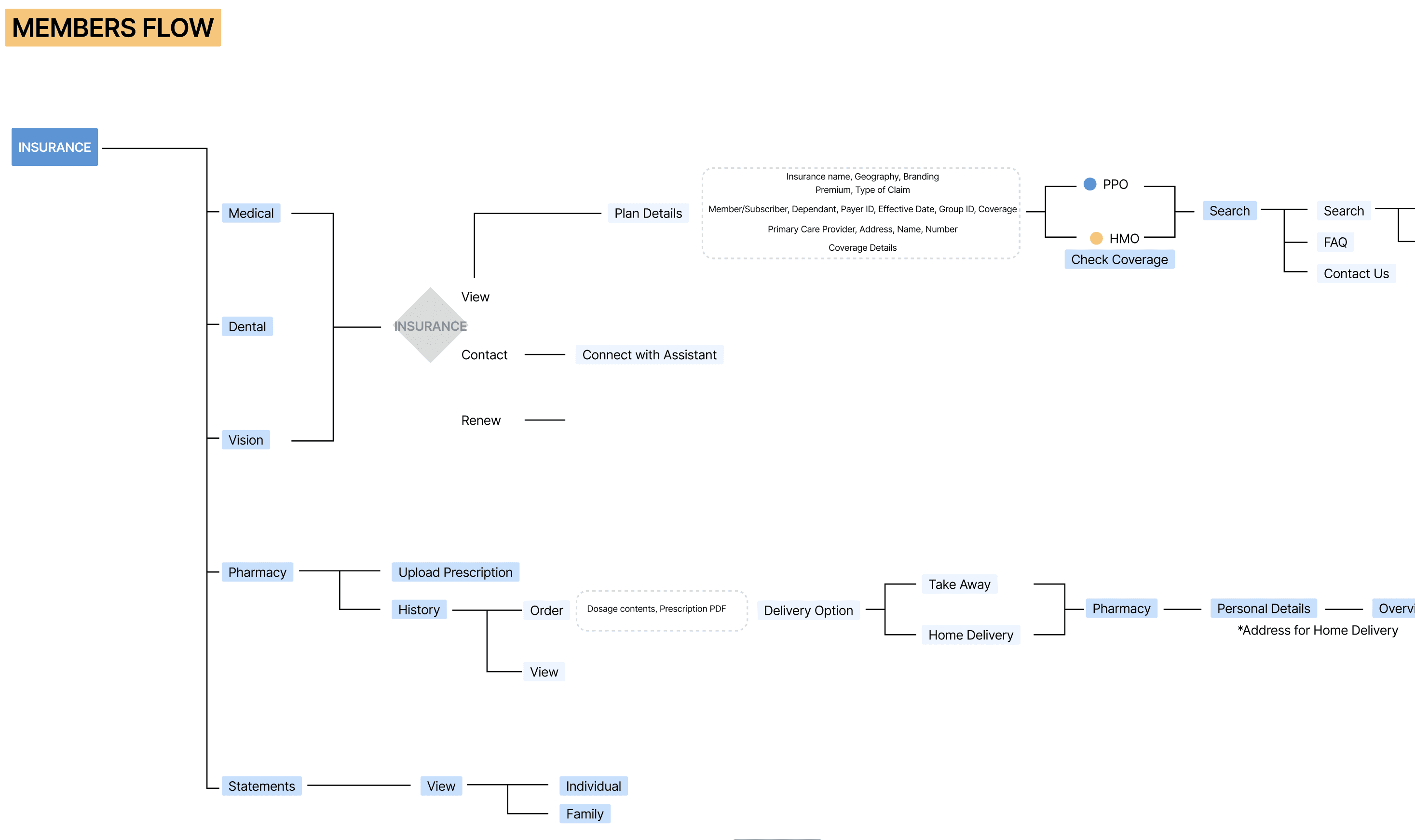
Information Architecture
Based on research insights and journey mapping, the information architecture was structured around key user needs and system priorities.
Core sections, Dashboard, Health & User, Claim Details, and Profile Management, were defined to simplify navigation and reduce cognitive load, so health insights, insurance information, and critical actions stayed organised, accessible, and logically connected.
Prototyping and MVP Development
The prototype was developed into a coded MVP (APK). A working build that let stakeholders move through real user flows and see the consolidated data and personalisation mechanic actually function, rather than just describe it.

KEY FEATURES
Streamline Data
What data matters, to whom,
and where should it live?
Every data point in this system serves someone differently, a payer needs claims history, a member needs their own health trend, a pharmacy needs a prescription, nothing more. Designing this meant asking what data was essential versus incidental, what could stay backstage, and what needed to surface at the front, and identifying which sources, existing or new, could actually feed this system.

Every touchpoint, one continuous record
A glucose alert routes straight to booking a provider. A prescription becomes a cart with real-time coverage from the active plan. Step data feeds into a continuous health record. Each of these used to live in a separate system, here, they're one connected flow.
Gamification
How do you make healthy behaviour
worth something?
A score means nothing if it's just a number. Designing this meant deciding what behaviours should count, how consistently they needed to happen to matter, and what a member actually gets in return, so improvement isn't just visible, it's redeemable.

Gamification and Score
Every connected device feeds the score, steps, glucose readings, sleep. But the platform doesn't just report the number, it explains it: a spike in stress, a medal for walking, a tip to fix a sleep cycle. The score becomes a running conversation about behaviour, not a static rating.
UX Personalisation
Turning 'improve your score' into a plan
Knowing a score can lower a premium isn't useful on its own, someone has to be told how. The platform closes that gap: nudges point to the next action, check-up alerts arrive before a follow-up is missed, and tips translate score movement into concrete steps a member can actually take.

Personalisation
The digital card replaces a static PDF with a live view of coverage, premium, deductible, and what's left before the out-of-pocket max.
The system doesn't stop at showing information: it flags when a device needs syncing, tracks a pattern of delayed check-ups, and surfaces tips, like fixing a sleep cycle, tied to what's actually moving the score. Each prompt is specific to what this member needs to do next.
OUTCOME
What we improved
1.
Consolidated 5 fragmented data sources, claims, device data, provider history, pharmacy, and policy data, into one continuously updating member view.
Insurers could see a member's full picture in one place, and members saw their health and their plan side by side for the first time.
2.
Designed a two-part scoring system that turned passive health data into a signal both sides could act on.
Insurers got two separate signals: whether care is being followed, and how members live between visits.
3.
Shifted the product model from reactive to proactive, from a policy members checked at claim time to an app that nudges, alerts and responds to behaviour.
Insurance got a reason to be opened between claims, which is the gap every audited app left open.
How the apps scored on the criteria that mattered
I scored every app against the same seven criteria, chosen from what members use most: claims, ID cards, support, refills and virtual care. The grey shape shows how well the market covers each one today.