Patient Sense
Patient Sense
A proof of concept that redesigned the workflows (Access Solution and Voice of Customer) inside a live patient data platform, replacing blank charts and unclear next steps with personalised, actionable insight.
Role
UX Researcher
Product Designer
Team
Design Director
Life Sciences Director
Data and AI Lead
Tools
Figma
Figjam
Google Suits
Timeline
2023 - 4 weeks
Full Time
OVERVIEW
Patient 360 re-envisions how the six teams, Access Solution, Voice of Customer, Marketing, Medical Affairs, and others, each worked within their own dashboard and view inside one shared Medallia setup. The data existed, but it wasn't easy to read, was painful to scan between individual and cohort level, and gave no direction on what to do next, so teams were spending more time working the data than acting on it.
A PoC built to fix exactly that: redesign how the data was visualised so it could actually be absorbed at a glance, make zooming between individual and cohort views effortless, and build next-step recommendations directly into the platform, so teams could stay inside the tool and act, instead of exporting data to work it out elsewhere.
MY ROLE
I led this project 0-1, from mapping the workflows of two domain stakeholders in this ecosystem around the platform, to designing how Access Solution and Voice of Customer could each read their data at a glance, move fluidly between individual and cohort views, and get a built-in next step instead of having to work it out themselves.
OVERVIEW
Patient 360 reenvisions the existing patient support platforms (Medallia, Qualtrics, Verint and others) already live and pulling in structured patient data through AI and machine learning. On paper, it had everything it needed. In practice, teams working inside it are stuck, KPI selections that produced blank charts instead of insight, no personalised direction on what to do next, and a rising cognitive load from a system that had data but no decision logic.
Rather than a full platform rebuild, this was a focused proof of concept: take two of the highest-friction domains like Access Solution and Voice of Customer, and redesign how each team could deep-dive into their own data independently, with clear guidance from insight to action.
MY ROLE
I owned this project end to end, from mapping the two domain stakeholders in this ecosystem around the platform, to diagnosing why the existing KPI logic was failing, to designing the individual Access Solution and Voice of Customer workflows following the Laws of Heuristics.
1.
Turned dense hundreds of row of raw data counts into visual formats, each shaped around the specific story that team's data needed to tell.
2.
Closed the gap between insight and action - next step exists the moment a problem is spotted, instead of a dead end.
3.
Reduce cohort-to-individual navigation down to a couple of clicks, with no filters to rebuild between the cohort lens and the individual lens.

Patient Sense
A proof of concept that redesigned the workflows (Access Solution and Voice of Customer) inside a live patient data platform, replacing blank charts and unclear next steps with personalised, actionable insight.
Role
UX Researcher
Product -
Service Designer
Team
Design Director
Life Sciences Director
Data and AI Lead
Tools
Figma
Figjam
Google Suits
Timeline
2023 - 4 weeks
Full Time
OVERVIEW
Data Quality Xpert is an AI-enabled enterprise platform designed to help organisations move from reactive data issue handling to proactive, business-aligned data quality management. By unifying monitoring, prioritisation, remediation, and impact visibility, the platform enables data teams and business leaders to act faster, with clarity and confidence.
MY ROLE
I was the sole designer on this project, embedded in a cross-functional team of data engineers, business analysts, and technical leads. Everything you read here is my work, from scoping the research to shipping the final prototype.
Enterprise data teams were drowning, not in bad data, but in disconnected tools with no unified view. Issues lived in one place, business impact in another, remediation in a third. Nothing talked to anything.
Over 10 weeks I designed an end-to-end platform (0 - 1 product) that connected all three into one coherent workflow, delivered as an MVP.
1.
Turned dense hundreds of row of raw data counts into visual formats, each shaped around the specific story that team's data needed to tell.
2.
Closed the gap between insight and action - next step exists the moment a problem is spotted, instead of a dead end.
3.
Reduce cohort-to-individual navigation down to a couple of clicks, with no filters to rebuild between the cohort lens and the individual lens.
Why
Patient 360?
A patient support platform was already live for a global pharmaceutical partner. But it had dense tables and raw counts that took real effort to read, filters that had to be rebuilt every time someone needed to move between an individual patient's case and a broader cohort view, and no system telling anyone what to actually do next.
Teams were spending more time working the data than acting on it. A platform meant to make patients feel supported was making the job harder for the people supporting them.
RESEARCH
As the researcher,
What would it take to make that data usable,
for employees working inside it and
patients waiting on other end of it?
Market Research
I mapped the ecosystem around the platform, six stakeholder domains, all drawing from the same patient data with little visibility into each other.
Patients and caregivers said as much directly: "don't ask me to repeat the same information over and over again," "the right hand does not know what the left hand is doing."
I mapped the ecosystem around the platform, six stakeholder domains, all drawing from the same patient data with little visibility into each other.
Patients and caregivers said as much directly: "don't ask me to repeat the same information over and over again," "the right hand does not know what the left hand is doing."
Auditing the existing feedback capture
Voice of Customer already ran on a Medallia-powered feedback flow, so I audited it end to end, branching logic, role-based questions, satisfaction scoring.
The form worked well, but the scores it produced sat in raw tables, took real effort to read, and required rebuilding filters every time someone wanted to move from an individual response to a cohort pattern.

Benchmarking against the existing CX Platforms
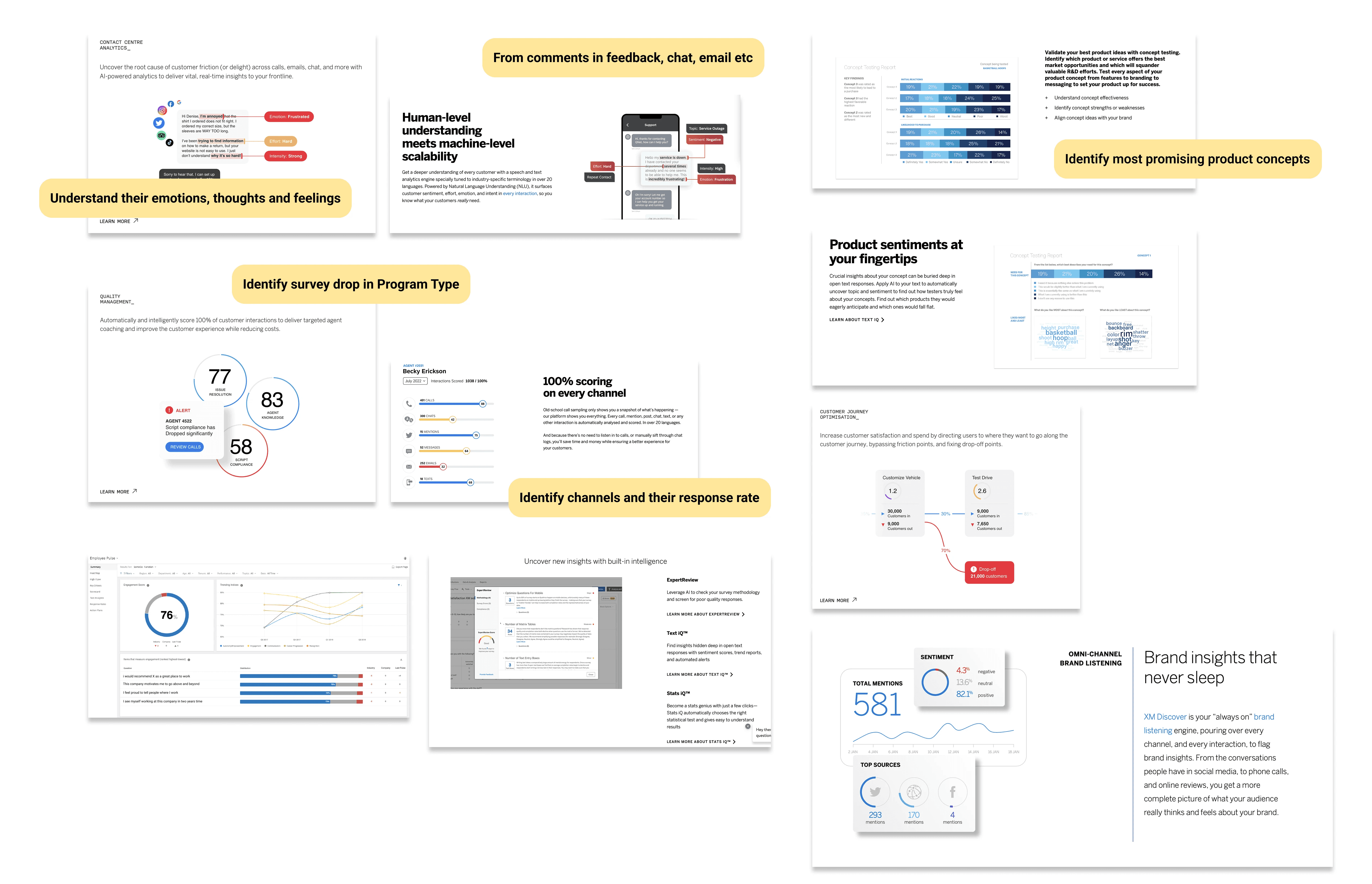
I looked at how leading CX platforms handle the same raw material, sentiment, channel response rates, journey drop-off.
The strongest ones did two things consistently: made dense data genuinely easy to scan, and told the user what to do next, automatically. Both were missing here.
SME Shadowing
Shadowing the SME behind the Medallia implementation surfaced the root cause directly: KPIs were often configured incorrectly at the source, so charts came up blank, and moving between an individual patient's record and a cohort-level view meant manually rebuilding filters every time.
What
was broken?
Across the research, the same three problems kept surfacing: the data was genuinely hard to absorb at a glance, zooming between individual and cohort views took real manual effort, and nothing in the system ever told anyone what to do next. It was a readability, navigation, and direction problem.
I synthesised the research into 3 insights that shaped every design decision that followed, not just what the platform should show, but what it needed to do.
DEFINE
As a systems thinker,
The problem was not missing data.
It was data that never showed the direction
1.
Data that took too much
effort to read
Consolidation isn't a
feature, it's the
foundation.
Raw counts and dense tables meant every team had to do real interpretive work just to understand their own numbers, before they could even think about acting on them.
2.
Friction zooming between
individual and cohort view
Consolidation isn't a
feature, it's the
foundation.
Moving from a single patient's case to a broader cohort pattern meant rebuilding filters from scratch each time. There was no fluid way to zoom in for individual context or zoom out for operational patterns.
3.
No personalisation by role
Consolidation isn't a
feature, it's the
foundation.
Everyone logged into the same generic view, regardless of what their role actually needed to see, and nothing about a session, filters, or focus area carried over to the next time they logged back in.
4.
No built-in next step
Consolidation isn't a
feature, it's the
foundation.
Even when a team found something worth acting on, the platform stopped at the insight. Nothing told them what to actually do about it, or let them act without leaving the tool.
What
was built?
I designed against the four problems Define had named, a visual hierarchy that cuts the effort to read the data, a role-based entry point that personalises the view from the start, guided zoom between cohort and individual baked into the visuals themselves, and a recommendation layer that gives every insight a next step.
DESIGN
As the product designer,
Four insights, one shared platform,
built differently for every use case.
KEY FEATURES
Data Visualisation
How do you make complex data
understandable at a glance?
Raw counts and dense tables meant little without context, a number alone doesn't tell a team if something needs attention now or can wait. Design asked how to turn the data each team already had into something scannable, so patterns, outliers, and priorities could be seen without reading every row first.
Access Solution
Access Solution's view was rows of benefits investigations, prior authorisations, and denials, numbers with no shape to them.
Cohort Insights
Here, the flow started with therapeutic area breaking down into products, and products breaking down into patient cohorts. Thus a sun-burst, letting a team see the whole structure before choosing where to drill in.

Voice of Customer
Voice of Customer's was a feedback form producing scores that sat flat on a page, and charts that came up blank whenever a KPI had been configured wrong at the source.

For Voice of Customer, it started with feedback flowing in from different channels toward different outcomes, so that became a Sankey diagram.
Individual case detail kept its own small set of visuals, a donut for resources used, a radar for service characteristics, so a single patient's record never got flattened into the same shape as a cohort's.

Personalisation
How do you make one login
feel built for the person using it?
Personalisation here was about their workflow, and the specific data they kept coming back to. Access Solution kept returning to denials, prior authorisations, and turnaround times to make their calls. Voice of Customer kept returning to sentiment, channel performance, and dissatisfaction patterns to make theirs. Role-based access was one way in, but the real work was mapping which data points each team actually used to make decisions, day to day, and designing the experience around those, not a generic dashboard everyone had to search through to find their own.
Unified Dasboard
One shared home for every patient-experience team, showing brand, program, and engagement data at a glance before anyone drills into their own workflow.

Version 1
Version 2 (After User testing)
Recommendation
How do you stop a team from
having to hunt for the next step?
Voice of Customer could see that a cohort was dissatisfied, the Sankey flow made that visible enough. But seeing dissatisfaction and knowing what to do about it were two different things, and the platform stopped at the first one. Design asked how the system itself could close that gap, so a team never had to leave the screen to figure out what came next.
Recommendation and Action
Selecting a flagged cohort, surfaces ranked recommendations directly on the same screen.
A rep can be assigned an up-skilling program right there, turning an insight into an action in the same click, instead of a dead end that someone has to plan around separately.

Zooming Lenses
How do you move between
one patient and thousands of them,
without losing focus?
A cohort pattern and an individual patient's case are two different lenses on the same data. The existing platform only really offered one lens at a time, and switching meant rebuilding a filter from nothing. Design asked how to make changing lenses feel like a single motion, not a reset.

Zooming lenses
A sun-burst view opens on the cohort lens, a therapeutic area breaking down into products and patient groups. Selecting one shifts the lens down to an individual case, with a journey timeline carrying that same context into specific touch-points and campaigns over time.
No filters to reconstruct, moving between lenses is built into the visual itself.
OUTCOME
What we improved
1.
Turned dense hundreds of row of raw data counts into visual formats, each shaped around the specific story that team's data needed to tell.
2.
Closed the gap between insight and action - next step exists the moment a problem is spotted, instead of a dead end.
3.
Reduce cohort-to-individual navigation down to a couple of clicks, with no filters to rebuild between the cohort lens and the individual lens.