Home
About
Data Quality
Data Quality Xpert
Designed an AI-assisted platform that unified detection, prioritisation, and remediation across four user roles and a fractured toolchain.
Role
UX Researcher
Product - Service Designer
Team
Design Director
Data and AI Team
Business Analyst
Developers
Tools
Figma
Figjam
Google Suits
Timeline
2023 - 10 weeks
Full Time
OVERVIEW
Data teams were short on a system that connected different data sources. Issues were caught in one tool, prioritised in another, and resolved in a third, with nothing talking to anything else.
Data Quality Xpert is an AI-assisted enterprise platform designed to close that gap. It connects business priority (KPIs, criticality) with technical workflows (rules, pipelines, remediation), so data teams and business leaders can act on the same information, at the same time.
MY ROLE
I was the sole designer on this project, embedded in a cross-functional team of data engineers, business analysts, and technical leads. Everything you read here is my work, from scoping the research to shipping the final prototype.
Over 10 weeks, I designed an end-to-end platform, from 0 to 1, that turned three disconnected systems into one coherent workflow, delivered as an MVP.
OVERVIEW
Data Quality Xpert is an AI-enabled enterprise platform designed to help organisations move from reactive data issue handling to proactive, business-aligned data quality management. By unifying monitoring, prioritisation, remediation, and impact visibility, the platform enables data teams and business leaders to act faster, with clarity and confidence.
MY ROLE
I was the sole designer on this project, embedded in a cross-functional team of data engineers, business analysts, and technical leads. Everything you read here is my work, from scoping the research to shipping the final prototype.
Enterprise data teams were drowning, not in bad data, but in disconnected tools with no unified view. Issues lived in one place, business impact in another, remediation in a third. Nothing talked to anything.
Over 10 weeks I designed an end-to-end platform (0 - 1 product) that connected all three into one coherent workflow, delivered as an MVP.
OUTCOME
OVERVIEW
Data teams were short on a system that connected different data sources. Issues were caught in one tool, prioritised in another, and resolved in a third, with nothing talking to anything else.
Data Quality Xpert is an AI-assisted enterprise platform designed to close that gap. It connects business priority (KPIs, criticality) with technical workflows (rules, pipelines, remediation), so data teams and business leaders can act on the same information, at the same time.
MY ROLE
I was the sole designer on this project, embedded in a cross-functional team of data engineers, business analysts, and technical leads. Everything you read here is my work, from scoping the research to shipping the final prototype.
Over 10 weeks, I designed an end-to-end platform, from 0 to 1, that turned three disconnected systems into one coherent workflow, delivered as an MVP.
1.
Consolidated 3 disconnected platforms into one coherent workflow, connecting business priority and technical action in the same system for the first time.
2.
Designed and shipped AI-powered decision support - validation, anomaly detection, and prioritisation, as a working part of the MVP.
3.
Built a reusable component library that held design consistency across every role-based dashboard and complex data workflow, within a 10-week Agile timeline.

RESEARCH
As the sole researcher,
Finding where the
system broke down
I scoped and ran the entire research phase independently. Where I defined what we needed to learn, selected which enterprise platforms to audit, and recruited and interviewed users across all four roles who would live in this system daily.
The research phase combined market analysis with qualitative user research to understand how data quality is currently managed across enterprise environments, and where existing tools and workflows fall short in supporting both technical and business users.
Given the scope and timeline of the project, the focus was on identifying patterns, gaps, and opportunity areas rather than producing exhaustive documentation.
RESEARCH
As the sole researcher,
Finding where the
system broke down
I scoped and ran the entire research phase independently. Where I defined what we needed to learn, selected which enterprise platforms to audit, and recruited and interviewed users across all four roles who would live in this system daily.
The research phase combined market analysis with qualitative user research to understand how data quality is currently managed across enterprise environments, and where existing tools and workflows fall short in supporting both technical and business users.
Given the scope and timeline of the project, the focus was on identifying patterns, gaps, and opportunity areas rather than producing exhaustive documentation.
Market Research
Conducted a comparative review of established enterprise data quality platforms The analysis was informed by hands-on exploration of available products, as well as walkthroughs from documentation to understand real usage patterns and system capabilities.
Reviewed established enterprise data quality platforms, Informatica, IBM Watson, Ataccama, Salesforce. Every platform solved part of the problem, but did not connect technical detection to business priority in one workflow.

User Research
User Research included interviews with data stewards, engineers, analysts, and business stakeholders who regularly use data quality platforms to understand their workflows, challenges, and expectations.
Insights
Across all four roles, distinct frustrations converged on one root cause: no shared system connecting detection, context, and action.
Desire for Real-Time Data Insights
“It takes too long to know if a fix actually works, I shouldn’t have to wait for hours to see results.”
Fragmented Workflows and Tool Sprawl
“I feel like I’m always patching issues instead of solving them proactively.”
Low Visibility and Misaligned Expectations
“Even when the data is fixed, I’m never really sure it’s the right data to base a decision on.”
Rising Pressure for Accuracy and Compliance
“Every time there’s a new report or regulation, it feels like we’re starting from scratch.”
DEFINE
As the systems thinker,
Failures that happened
in the handoffs
User Persona
Insights from the interviews were synthesised into key user personas representing distinct roles across the data quality workflow.
DEFINE
As the systems thinker,
Failures that happened
in the handoffs
User Persona
Insights from the interviews were synthesised into key user personas representing distinct roles across the data quality workflow.

Data Steward
Ensures data accuracy, consistency, and trust across business reporting.

Data Engineer
Builds and maintains data pipelines to enable reliable, scalable data flows.

Data Scientist
Analyses complex datasets to generate insights and support data-driven decisions.

C-Level / Lead
Use data quality signals to guide strategy, governance, and operational priorities.
Journey Mapping
The end-to-end data quality journey was mapped across all four personas, tracing how workflows, decisions, and information moved between roles. The map surfaced where support, visibility, or guidance broke down at critical handoff points, the moments this project was ultimately designed to fix.

DESIGN
As a product designer,
Every role gets exactly
the context they need
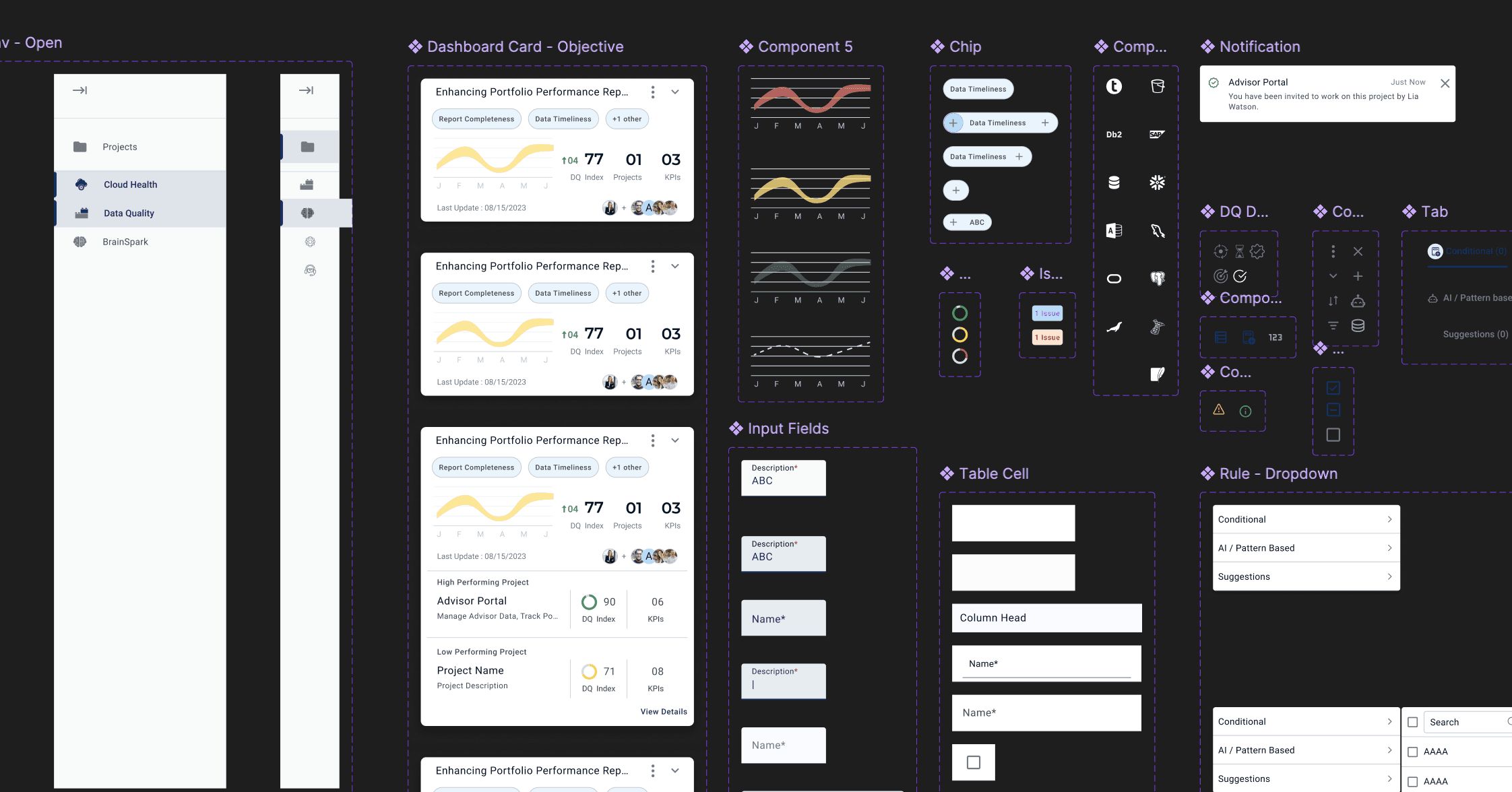
With the workflows and personas defined, the platform experience was designed. To ensure speed, consistency, and scalability across multiple dashboards and complex data workflows, creation of a UI component library from scratch was done, aligned to role-based needs and enterprise usability.
Design System
A component library in Figma kept design consistent across role-based dashboards and complex data workflows, while accelerating delivery within an Agile, 10-week timeline.
KEY FEATURES
Implementing AI
Role of AI
Where could AI reduce manual effort
without removing human judgment?
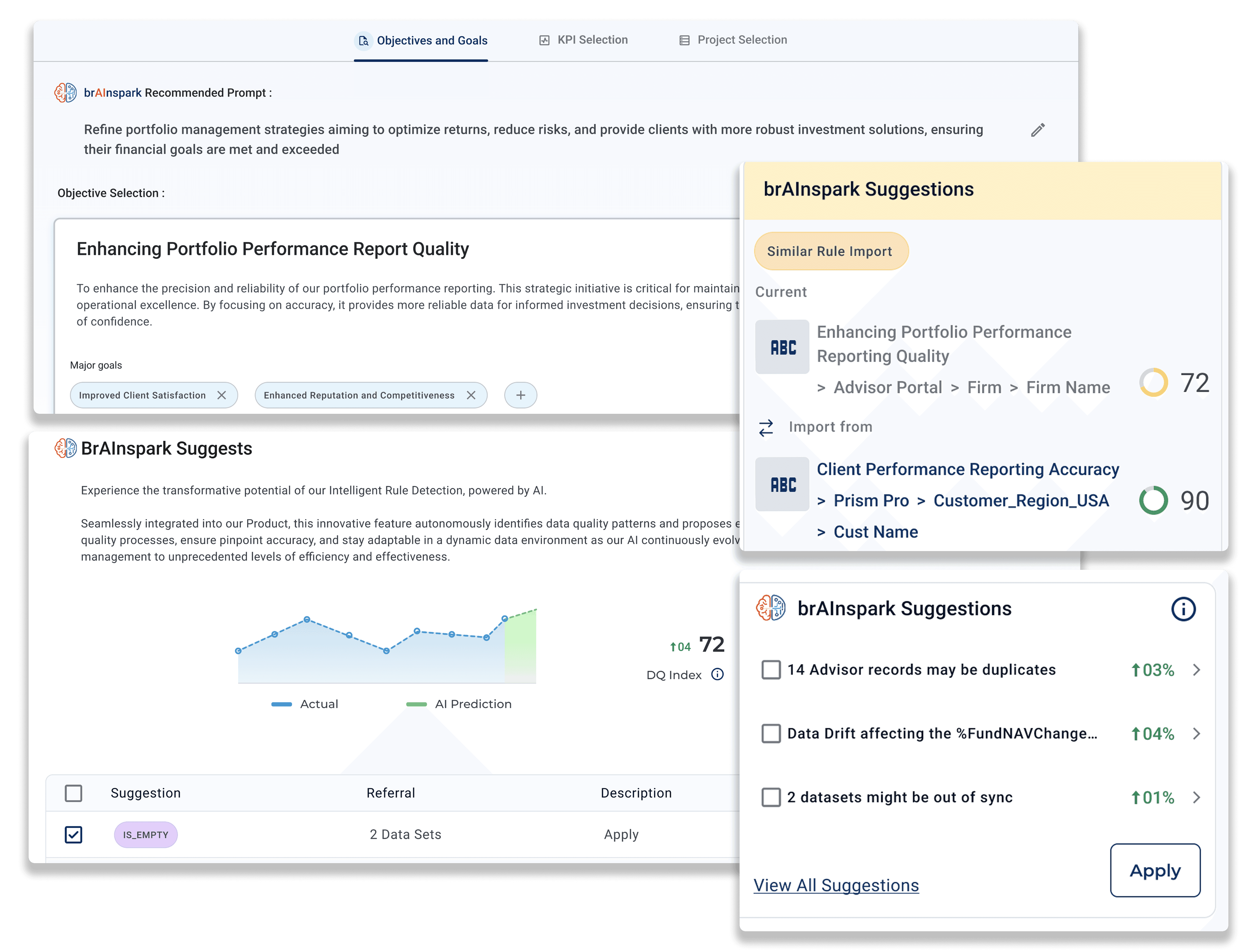
Design looked at three points in the workflow, rule validation, prioritisation, and remediation, and asked where AI could recommend rather than decide. AI was implemented to suggest validation rules, flag anomalies, and prioritise actions based on business impact, while final decisions stayed with the user.
AI Powered Guidance and Suggestions
AI supports decision-making by recommending validation rules, optimising workflows, and prioritising actions based on business impact.
Business Layer
What could address the
right approach to business problem?
Design approach needed a way to keep data stewards, engineers, analysts, and leadership aligned on the same project status, without forcing everyone into the same view. Business users could select objectives, assign KPIs, and review progress across other projects, connecting day-to-day technical action to business priority, with visibility into decisions as they were made. This way progress was visible to everyone, in the context relevant to their role.

Assigning objective and KPI
Business users define strategic objectives directly, with AI-recommended goals surfaced based on the objective entered.
KPIs are then selected and organised from a structured list, connecting each metric back to the objective it supports, so priority is set at the business level before any technical work begins.

Personalisation
How could one platform serve 4 different roles
without overwhelming any of them?
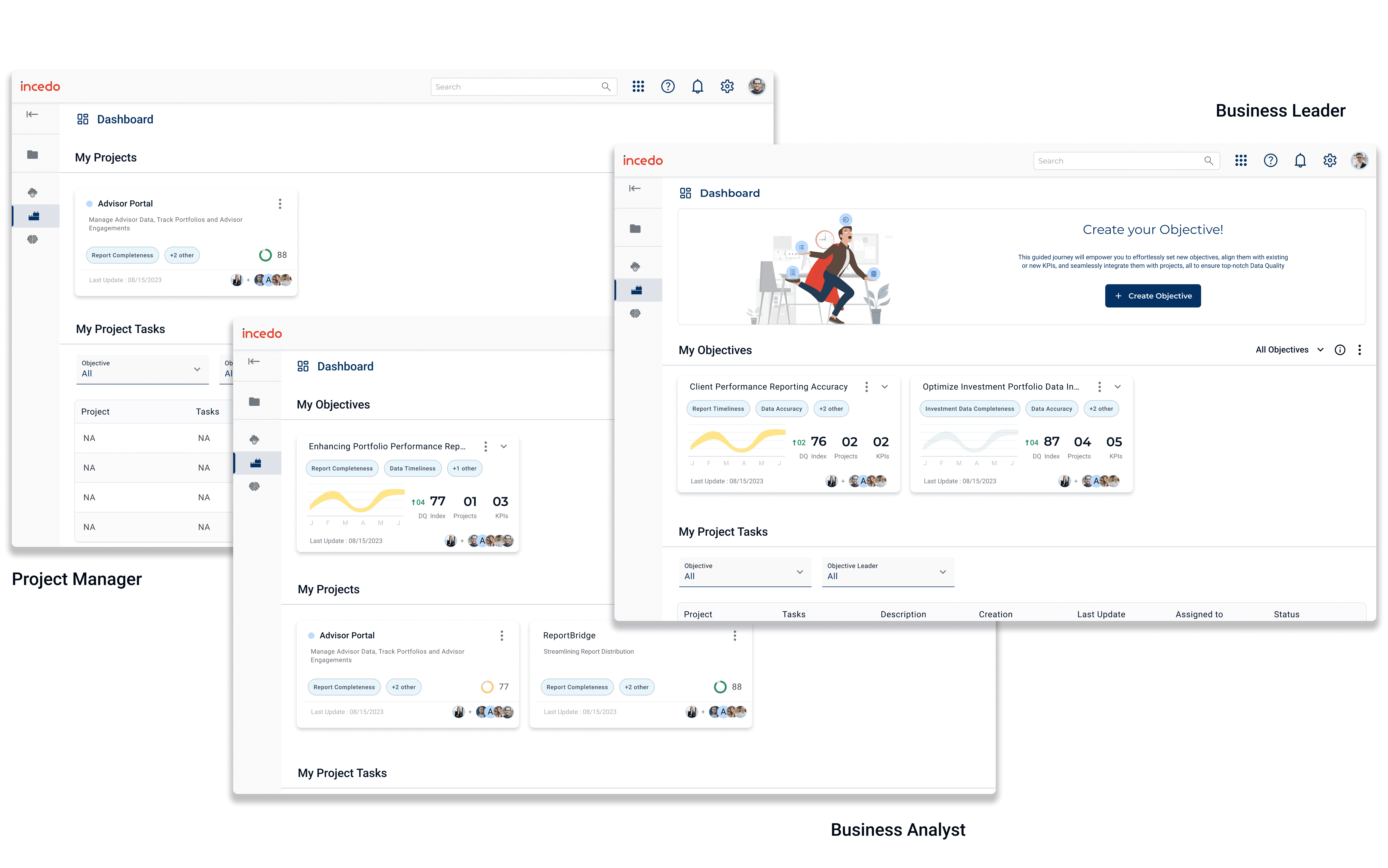
A data steward, an engineer, a scientist, and a C-level lead needed different things from the same system, different depth, different urgency, different language. Design asked what each role actually needed to see and act on, and what would just be noise. Personalisation was built around role, adapting dashboards, workflows, and access automatically based on who was signed in.
Persona-Centric Dashboards
Each role sees a version of the platform shaped for their responsibilities, a data steward sees accuracy and trust metrics, a C-level lead sees governance and strategic priorities.
Access and workflow steps adjust the same way, so no one wades through detail that isn't theirs to act on.
Customisation
Where should the system stop deciding,
and let the user take over?
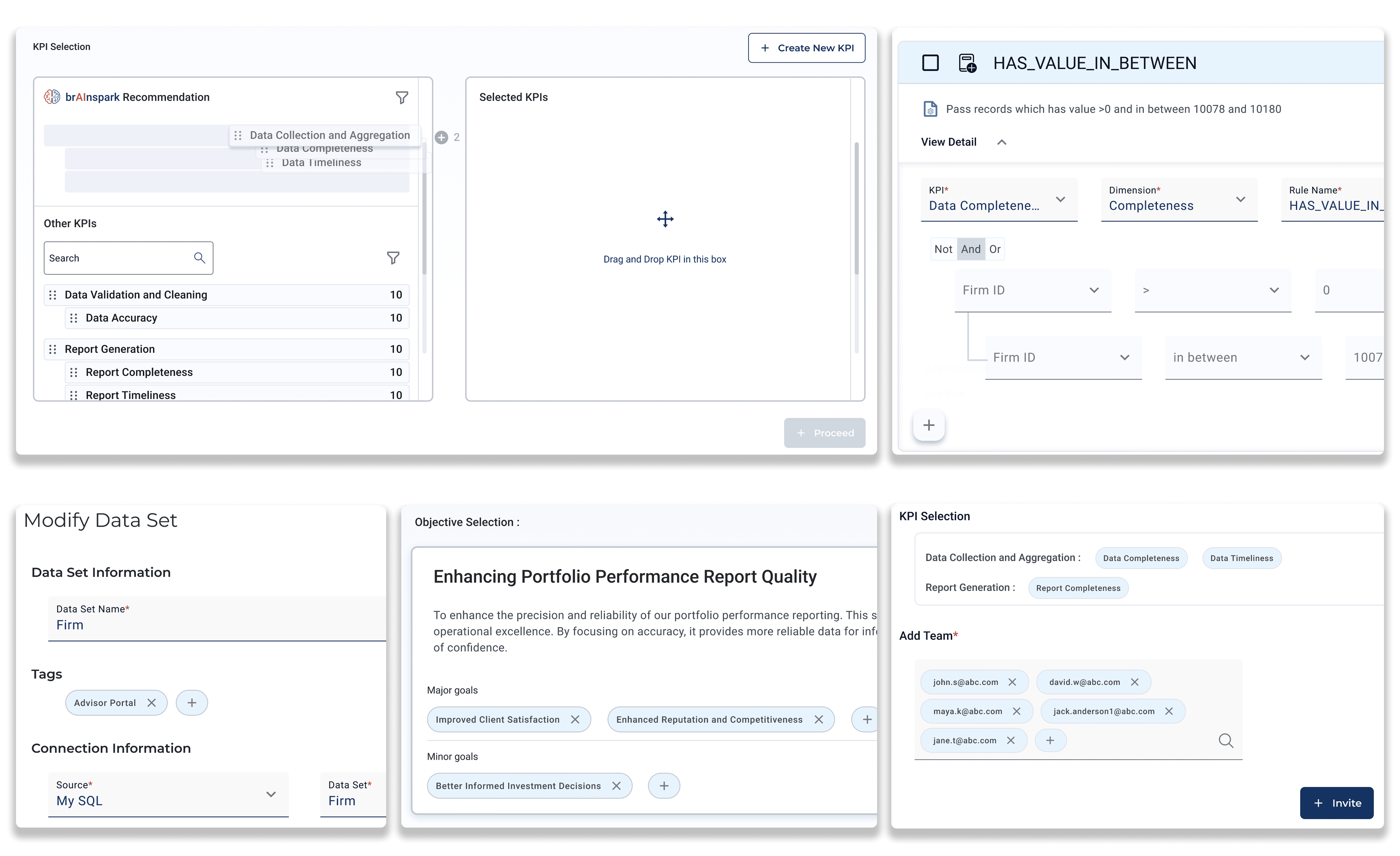
Personalisation handled what each role needed to see. But within their own role, users still needed to shape the system to their specific priorities, not just receive a fixed view. Thus focus was on which controls should be handed directly to users, rather than automated or preset.
Customisation
Users can customise rules, KPIs, objectives, and tags to fit their workflows, while built-in collaboration tools support shared ownership, task assignment, and data governance.
Data Visualisation
How do you make complex data
understandable at a glance?
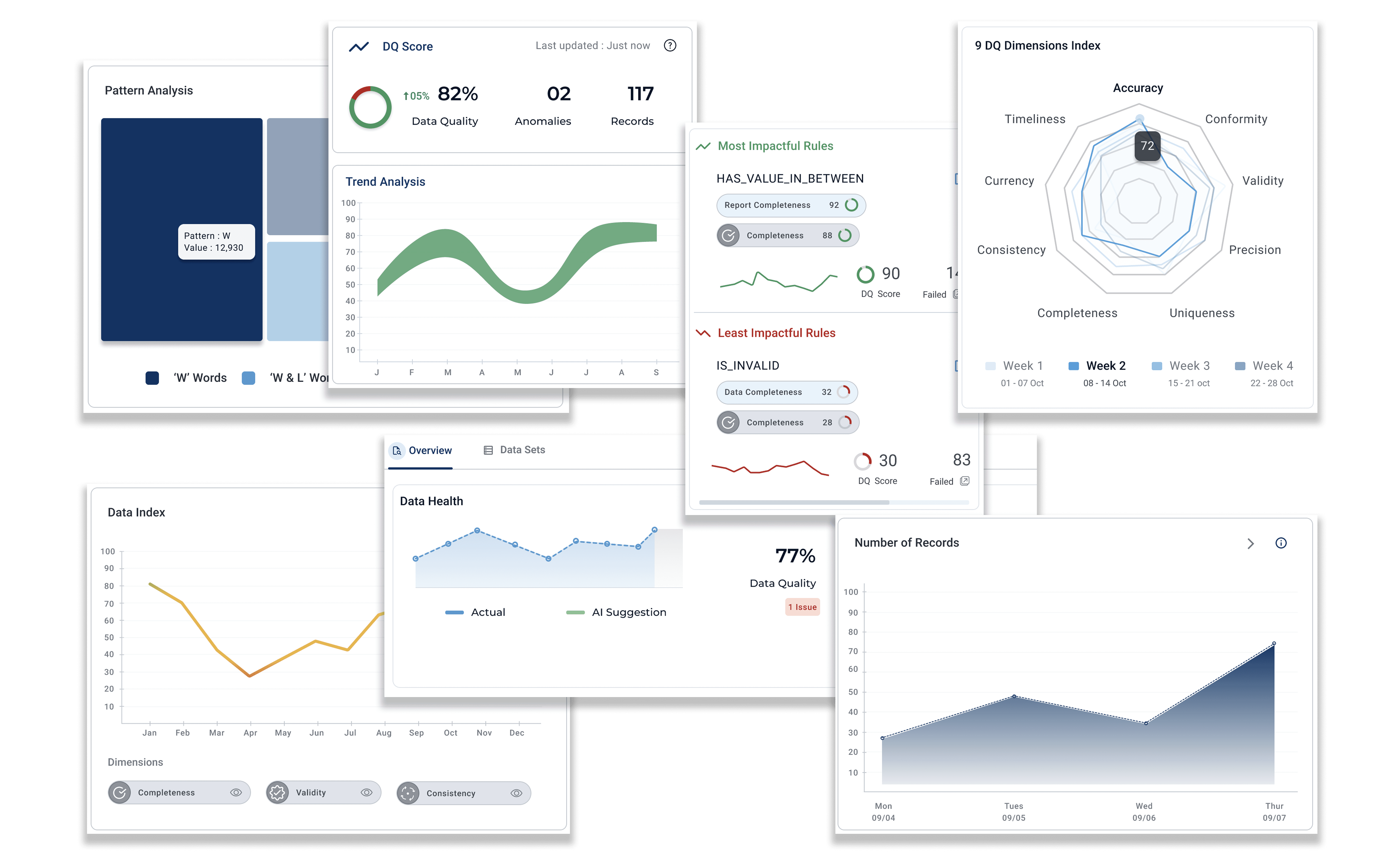
Raw data quality metrics meant little without context, a number alone doesn't tell a user if something needs attention now or can wait. Design asked how to turn tracked metrics into something scannable, so users could spot what mattered without interpreting a spreadsheet first.
Data Visualisation & Insight Delivery
Complex data is translated into charts and visual patterns, trends, anomalies, and critical issues, so users can identify what needs attention at a glance, not after analysis.
OUTCOME
What changed
1.
Consolidated 3 disconnected platforms into one coherent workflow, connecting business priority and technical action in the same system for the first time.
2.
Designed and shipped AI-powered decision support - validation, anomaly detection, and prioritisation, as a working part of the MVP.
3.
Built a reusable component library that held design consistency across every role-based dashboard and complex data workflow, within a 10-week Agile timeline.